- August 24, 2015
- Posted by: andreag
- Category: Metrics

From the numbers of folks who have downloaded our article on metrics, we know it is a topic of interest to our regular readers. We have had the question asked several times “How do I build a metric”. So we thought it was time for us to tackle the steps.
We will take you through the questions to answer and steps to take in order to build a metric and chart that you can use to better analyze a system in your organization. What we won’t be touching in this topic is how to operate the program we use, Excel. There are many good resources available on how to use Excel to build charts. Our focus here is on what data you need, what the graph should look like, etc.
So here are the steps we take to create a simple graph:
- Identify the title of your metric
- Identify why the measure is important for you to display. Specifically what will it tell you about the organization that would otherwise be difficult to know.
- Identify the data needed to create the measure and where that data comes from
- Identify the type of graph. For this post, we will consider the two most common charts – run charts and bar charts. Run charts are best to show data over a period of time, like the number of customer complaints each month for the last year. Bar charts are best to show point in time data, like how many of each type product were purchased this month.
- Determine how often you will plot the data – monthly, weekly, etc.
- Determine your x and y axis scale – months of the year, types of products, percentages are all possibilities.
- What is your target. For example, a pizza delivery service might set a delivery target at 30 minutes.
- Finally, determine who will produce the metric, who will analyze it and when will it be reviewed with the leadership team.
Several of these steps have caveats to be considered.
- For step 2: in order for a metric to be valuable and not wasted time and effort, it needs to show you something you would not likely see otherwise or at least would not see as clearly as with a graph.
- For step 3: if data is too costly or time-consuming to collect, you need to consider other ways to gather the information or determine if the graph is of enough value to warrant the expense of gathering the data
- For step 5: if you can only plot the data yearly, ask if it is valuable to graph. We recommend that our clients be able to plot the data at least monthly to consider it a valuable, useful picture of what is happening in the organization. With a much longer time frame, it is too difficult to see a problem and react appropriately to fix it.
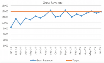
So for a quick example. Let’s say a small bookstore wants to graph their gross revenue over time.
- Title: Gross Revenue

- Importance: the graph will display trends up or down over time, so that we can make appropriate changes.
- Data: gross revenue in the door each month
- Type of graph: we need a run chart so that we can see changes and trends over time
- Frequency: we will plot the data monthly
- X axis will be the months of the year. Y axis will be dollars
- The target is 12,ooo dollars in gross revenue each month – to cover bills, taxes and payroll, with some profit left to reinvest.
And that is all there is to it. For more in depth information on metrics, we encourage you to read the library article on Choosing your Organization’s Metrics or click on the Metrics category on the right for other blog posts covering the topic.
If you have any questions or would like to be coached through your first metric, we would be happy to help. Contact us via e-mail to get started.


